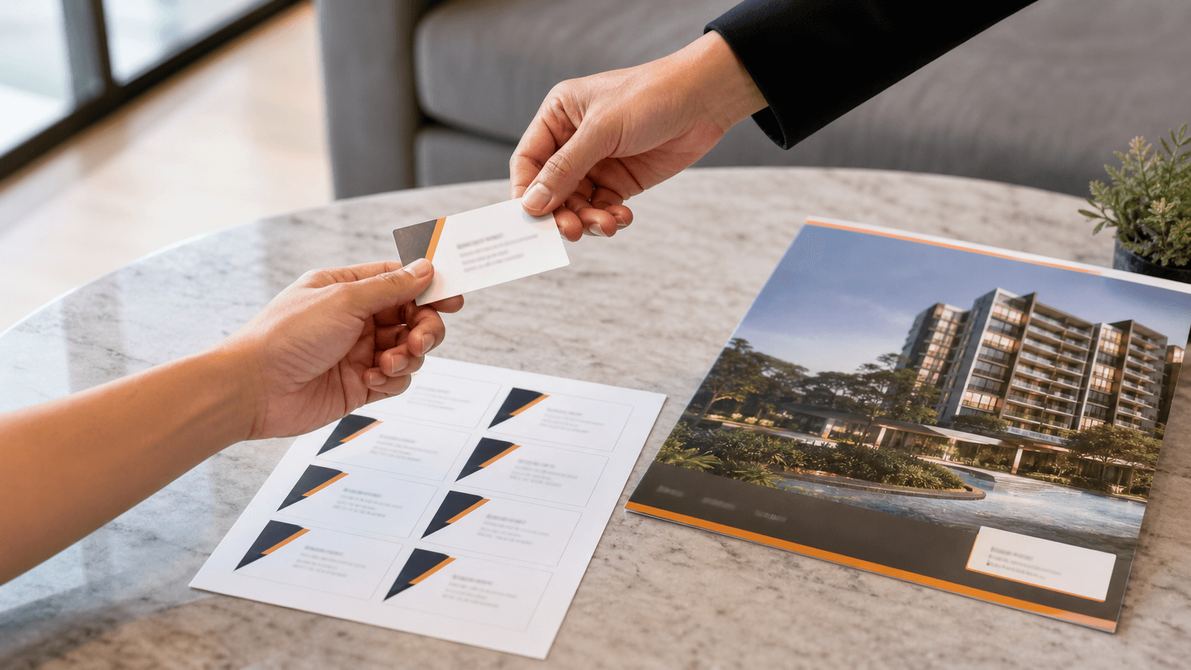
In a digital-first world, it’s easy to think printed cards no longer matter. But in real business settings, a name card still does something digital contact sharing often can’t: it creates a physical reminder of who you are. After a meeting, event, or quick introduction, that small card can stay in someone’s wallet, notebook, or on their desk long after the conversation ends.
Name cards can transform a quick introduction into a lasting impression, and a well-designed one reinforces your professionalism and attention to detail. In this guide, we’ll walk through the key elements that make a card effective, including layout, content, materials, and print setup. The goal is simple: help you create a card that not only looks polished but also leaves a lasting impression on potential clients.
A Guide To Designing Name Cards That Make A Lasting Impression:
Start with the purpose of your card.
- Before choosing colours, fonts, or finishes, think about the kind of impression you want to leave.
- A name card for a corporate consultant will likely look very different from one for a designer, property agent, or café owner. The goal is to create a card that feels aligned with your brand and speaks to the clients you want to attract.
Keep the information focused and useful.
- A good card should make it easy for someone to know who you are and how to contact you.
- In most cases, that means including your name, job title, company name, phone number, email address, and website.
- You can also add a QR code, but only if it leads somewhere useful, such as your portfolio, booking page, or company site.
- Avoid filling the card with too many details, as clutter makes it harder for the important information to stand out.
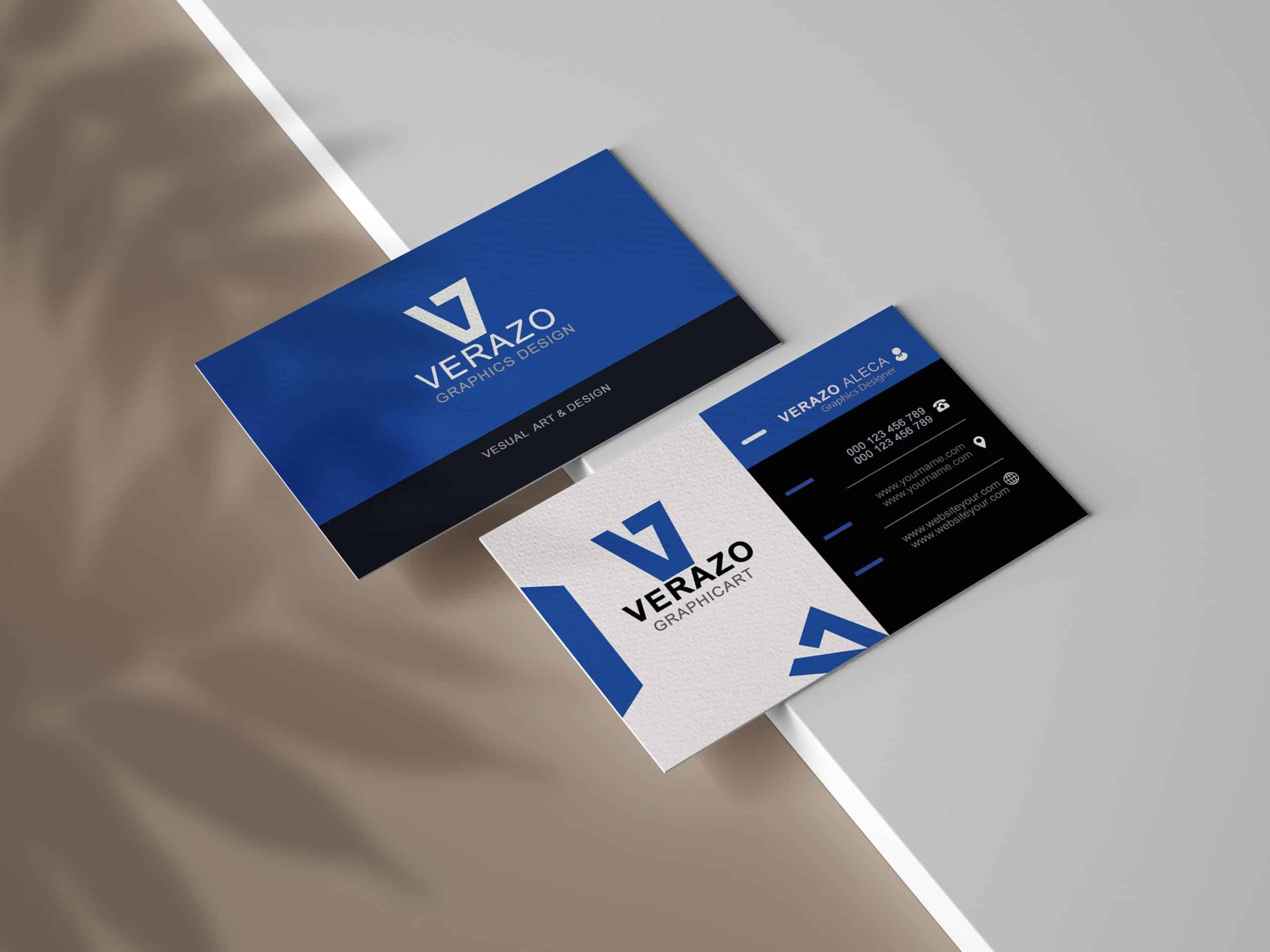
Build a layout that is easy to scan.
- The most effective cards are clean, balanced, and easy to read at a glance.
- Your name should usually be the most prominent element, followed by your role or company, then your contact details.
- Spacing matters just as much as content. When the layout has enough room to breathe, the card looks more polished and professional.
- If you’re not sure whether your design looks too crowded and want a printing partner who can also advise on the layout, Orange Print can help refine it into a cleaner, print-ready design.
Choose fonts that look professional in print.
- Fonts shape how your brand is perceived, so readability should always come first.
- Stick to one or two typefaces that look clean and professional, and avoid overly decorative styles that may be hard to read once printed.
- A font that looks attractive on screen may not always work well at a small size, so it is important to think about the final printed result, not just the digital file. At Orange Print, we often help our clients choose fonts that stay clear, sharp, and professional in the final print.
Use colour with intention.
- Colour should support your brand, not overpower the card.
- Strong contrast between the text and background keeps your details easy to read. However, a simple colour palette often looks more polished than one with too many competing shades.
- If your brand already uses certain colours, keep them consistent here so the card feels like a natural extension of your business identity.
Pick the right format for your brand.
- Standard cards work well for most businesses, but the right format depends on how you want to present yourself.
- A horizontal layout feels classic and familiar, while a vertical card can feel more modern.
- Double-sided cards are also useful when you want to include a QR code, tagline, map, or extra branding without overloading the front.
- For businesses looking beyond a standard single-sided layout, we offer a wide variety of styles.
Don’t overlook paper stock and finish.
- The material and finish of your card affect how it feels in hand, and that tangible appeal matters.
- A thicker stock often feels more premium, while matte, glossy, or textured finishes can help reinforce a certain brand image.
- Matte finishes usually pair well with sleek, modern designs, while glossy finishes are often better for vibrant, image-led layouts.
- This is where working with a reputable printing company matters, because the right advice can help you choose a finish that suits both your design and budget.
Make sure your artwork is ready for print.
- Even a strong design can be let down by poor file preparation.
- Use high-resolution graphics, set up proper margins and bleed, and save the file in the correct format for printing.
- You should also ensure the text is neatly aligned, and the essential elements have enough space from the edge. At this stage, we can help ensure your artwork is set up properly for a clean print.
A well-designed card only works if the print quality matches the design. Sharp text, accurate colour, and good material choice all contribute to the final impression your card leaves. If you are evaluating printing shops in Singapore for reliable name card printing service, Orange Print is worth considering. We can help you match the right stock, finish, and format to your unique business needs.
Conclusion:
A well-designed name card does more than share your contact details. It reflects your brand, strengthens your credibility, and helps clients remember you long after the first meeting. Get in touch with Orange Print today to find the right stock, finish, and format for your business and make every first impression count.