You approved a bright, punchy design on screen. The printed version came back flatter, the blue a little greyer, the neon not quite neon. Nothing went wrong at the printer – it is the difference between CMYK and RGB. This guide explains what that means and how to set up your file so the print matches what you expect.
Key takeaways
- RGB is for screens; CMYK is for print. They mix colour in opposite ways.
- Screens glow (add light); ink absorbs light, so print cannot hit every bright screen colour.
- The colours that shift most are bright blues, greens, oranges, and any neon or fluorescent.
- Design or convert to CMYK before printing so you see the real colours early, not after printing.
- For exact brand colours, use a Pantone (spot) colour, not just a CMYK mix.
- Hex codes (like #1A73E8) are RGB – they are a screen value, not a print recipe.
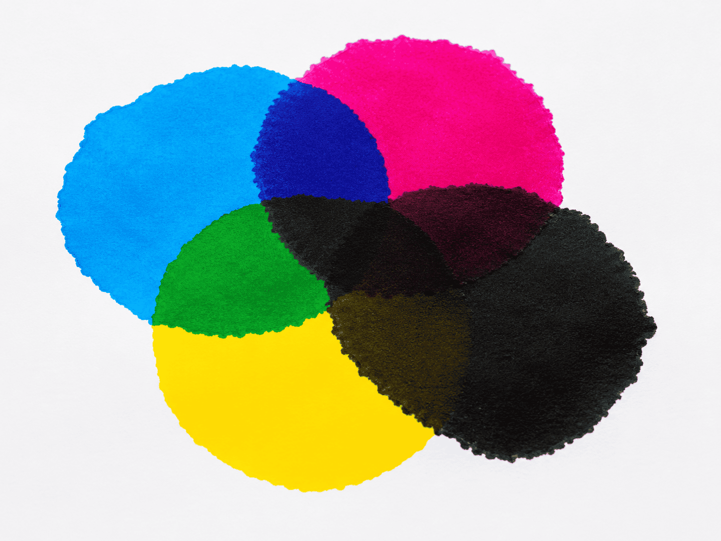
CMYK and RGB are two ways of making colour. RGB (red, green, blue) is how screens build colour with light, and it covers a wide, bright range. CMYK (cyan, magenta, yellow, black) is how printers build colour with ink, and its range is smaller. Files set to RGB look brighter on screen than they can print.
What is the difference between CMYK and RGB?
RGB and CMYK are opposite colour systems. RGB adds coloured light – red, green, and blue – to a black screen, so more light means brighter colour. CMYK layers cyan, magenta, yellow, and black ink on white paper, so more ink means darker colour. Screens emit light; paper reflects it.
That single difference explains almost everything else. A screen can fire pure, intense light at your eye, which is why neon and electric colours look so vivid on a monitor or phone. Ink can only ever reflect part of the light that lands on the paper, so it physically cannot reach those same intense colours. The “K” in CMYK stands for “key”, the black plate that adds depth and detail.
Why do my colours look different when printed?
Printed colours look different because ink cannot reproduce every colour a screen can show. The range of colour a system can produce is called its “gamut”, and RGB has a wider gamut than CMYK. When a bright RGB colour falls outside the CMYK range, it gets mapped to the nearest printable colour – usually a slightly duller version.
This is most obvious with vivid, saturated colours. A glowing on-screen blue becomes a more muted blue on paper. A bright green loses some of its zing. The shift is not a fault – it is the honest limit of ink on paper. The good news is that it is predictable, so you can see it before you commit by working in CMYK from the start.
Which colours change the most?
The colours that shift most from screen to print are the brightest ones: electric blues, vivid greens, bright oranges, and anything neon or fluorescent. Soft, muted, and natural tones – skin tones, greys, pastels, earthy colours – barely change. The richer and more glowing a colour looks on screen, the more it tends to settle down in print.
If your brand or design leans on a vivid colour, this matters. A few common trouble spots:
- Bright blues and purples – tend to lose intensity and can drift slightly.
- Vivid greens – one of the hardest colours for CMYK to match.
- Neon and fluorescent – not achievable with standard CMYK ink at all; they need a special spot ink.
- Bright orange and red – usually print well but can look slightly less “hot”.
Should I design in CMYK or RGB?
For anything going to print, work in CMYK. Setting your document to CMYK from the start means you see realistic, printable colours while you design, instead of being surprised after printing. If you design in RGB, the colours on screen are a promise the printer cannot always keep.
There is a practical exception. Some tools – Canva, Microsoft Word, many free apps – only work in RGB and do not let you switch. That is fine; it just means your printer (or you, at export) converts to CMYK at the end, and you should expect the bright colours to settle a little. If colour accuracy is critical, design in a CMYK-capable tool, or send us your file and ask for a printed proof before the full run.
How to convert RGB to CMYK before printing
You convert to CMYK in your design software’s colour or document settings, ideally before you start. In professional tools this is a document colour mode; in office and free tools it usually happens when you export to PDF. Converting early lets you adjust any colour that shifts, rather than discovering it on the printed sheet.
A quick guide by tool:
- Adobe Illustrator / InDesign / Photoshop – set the document colour mode to CMYK. Best option for colour control.
- Canva – works in RGB only. Export as a print PDF and expect a slight shift, or send us the file to check.
- Microsoft Word / PowerPoint – RGB only; the conversion happens at PDF export. Fine for simple jobs, not for precise brand colour.
- Affinity Designer / Photo – set the document to CMYK in the colour settings.
If you are not sure, you do not have to solve this alone. Send your file to us on WhatsApp and we will tell you whether the colours will hold up, before anything is printed.
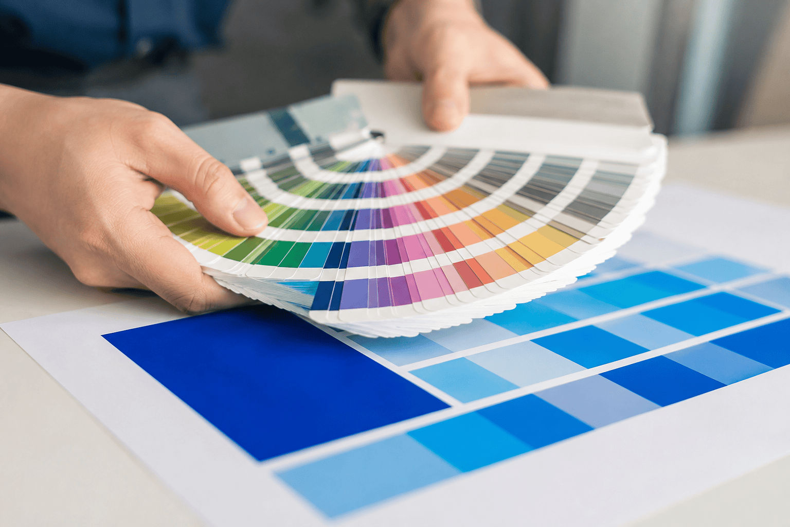
What about Pantone and brand colours?
For an exact, consistent brand colour, use a Pantone (spot) colour rather than a CMYK mix. Pantone colours are pre-mixed inks with a fixed recipe, so your brand blue prints the same every time, on every order. A CMYK build of the same colour can vary slightly between jobs and can look duller than the Pantone original.
This matters most for logos and corporate identity, where a colour has to match across name cards, letterheads, stickers, and packaging. If your brand guidelines list a Pantone number, give it to us and we can match it (spot-colour printing is quoted separately). If you only have a hex code, remember that is an RGB screen value – we can convert it, but a printed proof is the safe way to confirm it looks right.
CMYK vs RGB at a glance
| RGB | CMYK | |
|---|---|---|
| Used for | Screens, web, social, video | Printing on paper and most materials |
| Made from | Red, green, blue light | Cyan, magenta, yellow, black ink |
| How colour builds | Adds light (brighter = more light) | Adds ink (darker = more ink) |
| Colour range | Wider – very bright colours | Narrower – bright colours settle |
| Colour codes | Hex (#RRGGBB), RGB values | CMYK percentages, or Pantone |
| Best for | Anything viewed on a screen | Anything you will hold in your hand |
Frequently asked questions
What does CMYK stand for?
CMYK stands for cyan, magenta, yellow, and key (black). These are the four ink colours a printer layers on white paper to build a full-colour image. The “key” black adds depth, shadow, and crisp text. Almost all everyday printing – cards, flyers, stickers, booklets – uses CMYK.
Why does my blue print look purple or dull?
Bright blue is one of the colours that shifts most from screen to print, because it sits near the edge of what ink can reproduce. A vivid RGB blue often prints slightly duller or can lean purple once converted to CMYK. Designing in CMYK, or using a Pantone blue, fixes this.
Can you print the exact colour I see on my screen?
Not always exactly. Screens show colours with light that ink cannot fully match, so very bright colours print a little softer. We can get very close, and for an exact brand colour we use a Pantone spot ink. If colour is critical, ask for a printed proof before the full run.
Is a hex code the same as a print colour?
No. A hex code such as #1A73E8 is an RGB value made for screens. It is not a print recipe. We can convert a hex code to CMYK or match it to a Pantone colour, but the printed result may look slightly different from the screen, so confirm with a proof if the colour matters.
My design tool only has RGB. Is that a problem?
Usually not. Tools like Canva and Word are RGB only, and the conversion to CMYK happens when the file is printed. Your job will still print well – just expect bright colours to settle slightly. If you need precise colour, design in a CMYK tool or send us the file for a quick check first.
Do I need to convert to CMYK myself?
You do not have to. If you send an RGB file, we convert it for print. But converting yourself (or designing in CMYK) lets you see and adjust any colour shift before printing, which gives you more control. Either way, send us the file and we will flag anything that looks risky.
Get your colours right before you print
CMYK versus RGB sounds technical, but the practical version is simple: screens glow, ink does not, so set your file to CMYK and your brightest colours will not surprise you. For brand colours that must match every time, use a Pantone ink.
Not sure whether your file will print true to screen? Send it to us on WhatsApp at 8438 1313 and we will check the colours before anything goes to print – or use the chat box at the bottom right of any page. Ready to order? Explore our business card and sticker and label printing, and see our guide on designing custom stickers for more file-prep tips.